The Crux
Based on Plato's philosophical exploration of Socrates allegorical Cave of Ignorance
The Cover and start of the Main Story beginning with the flasback to the first Prisoner, Meh.
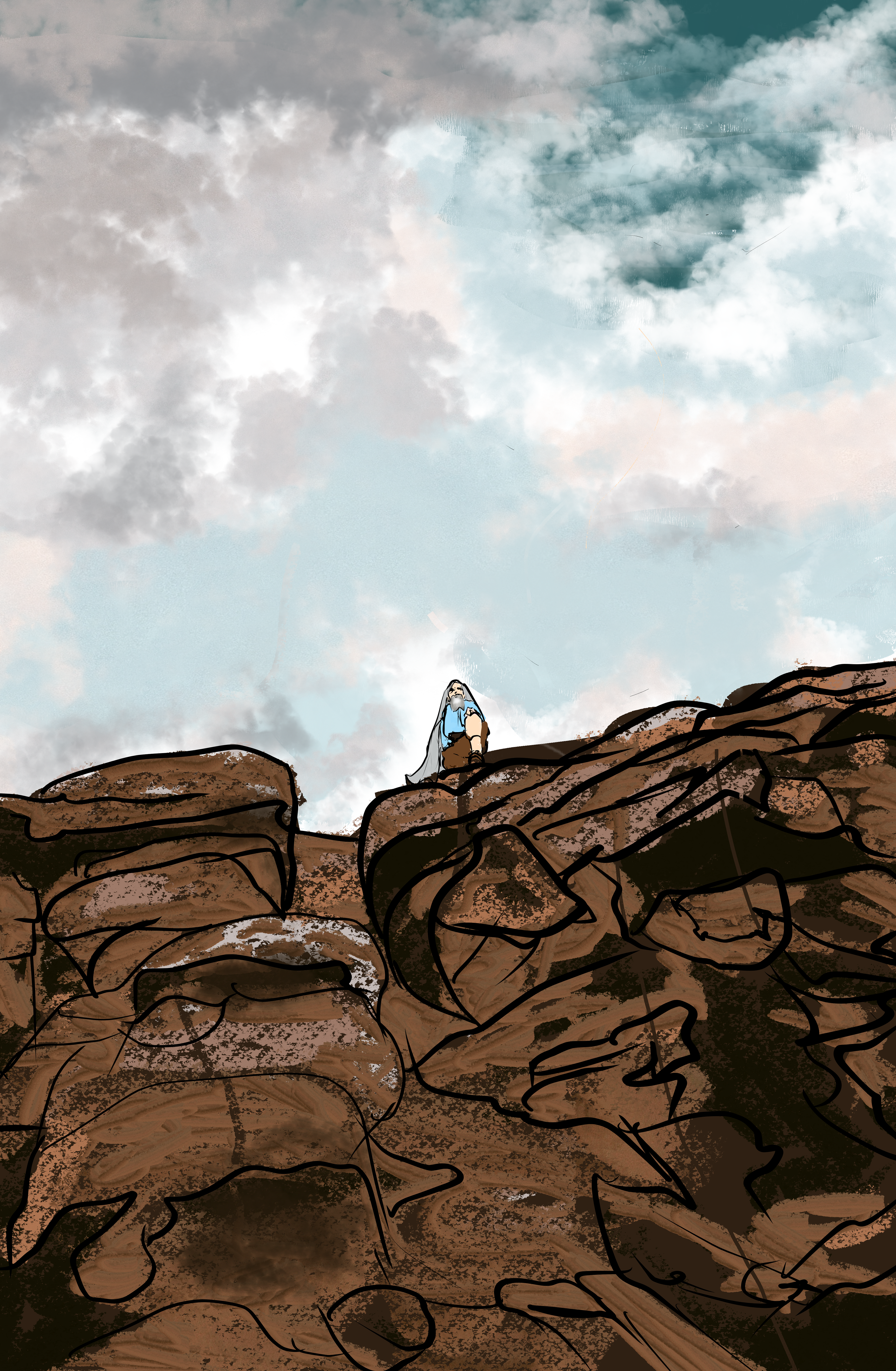
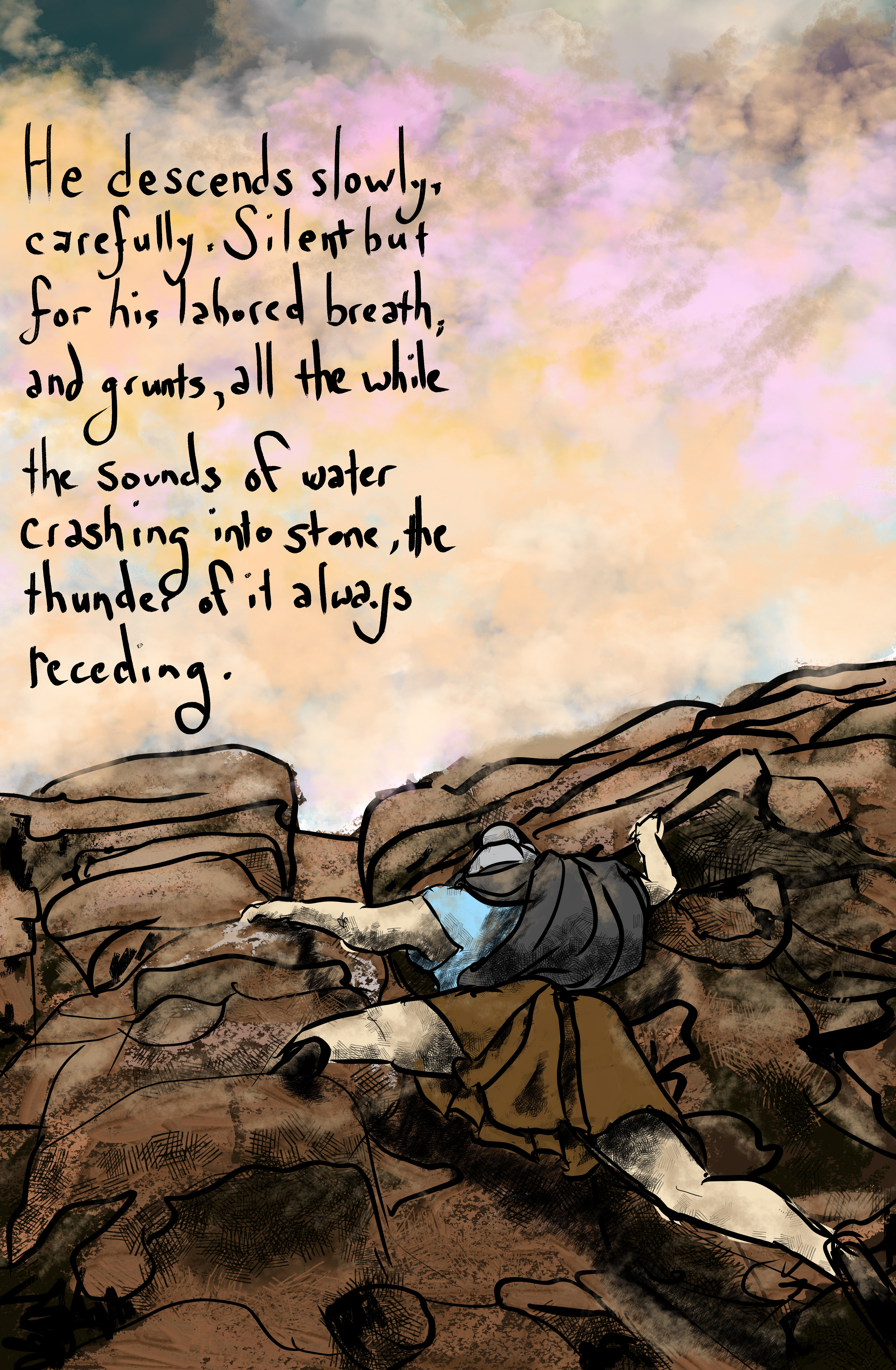
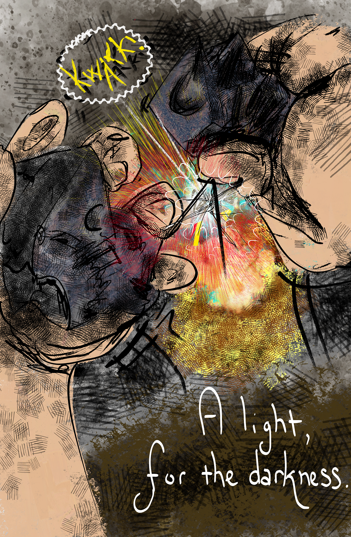

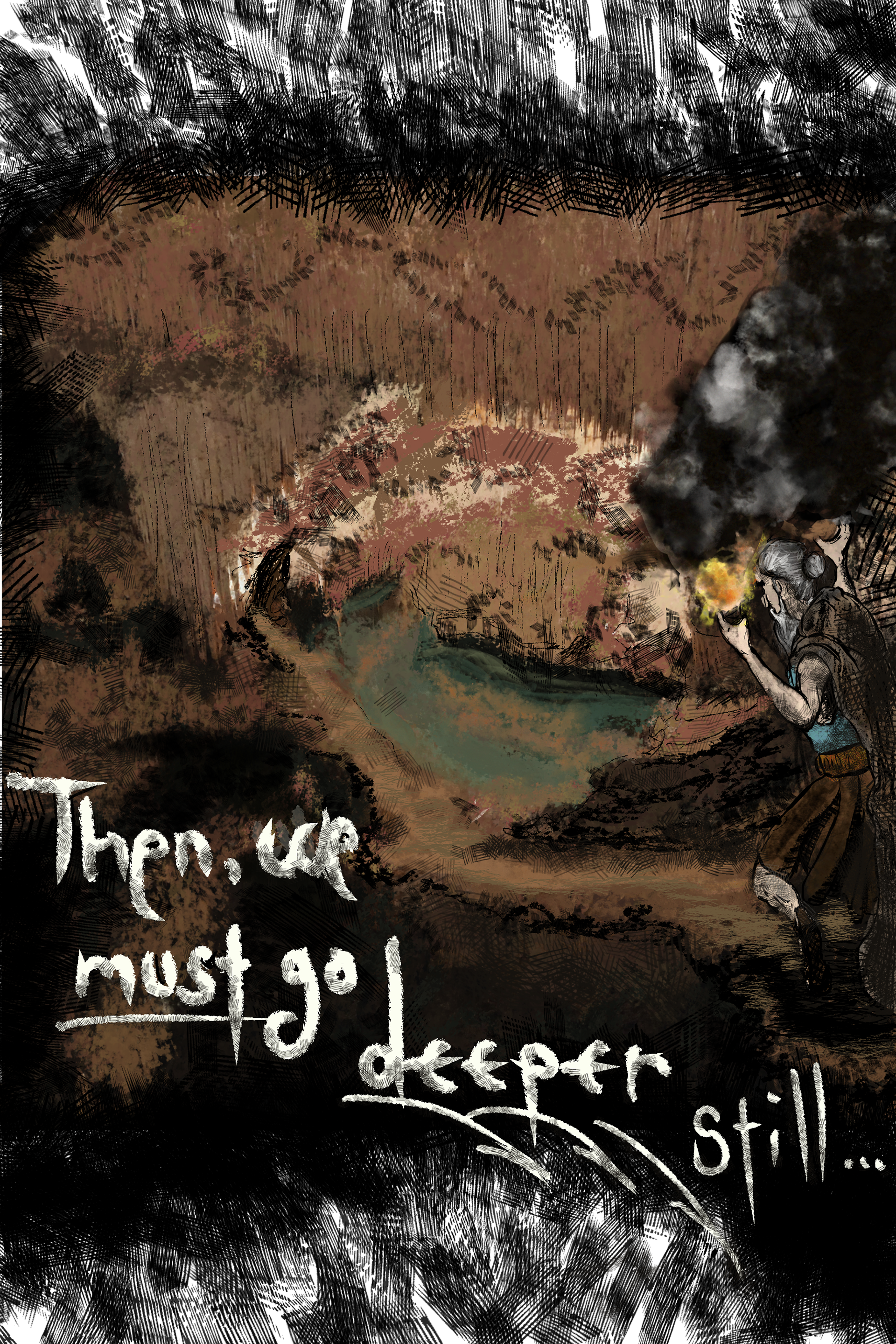
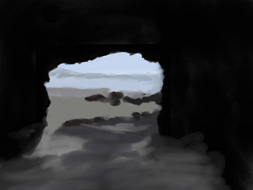


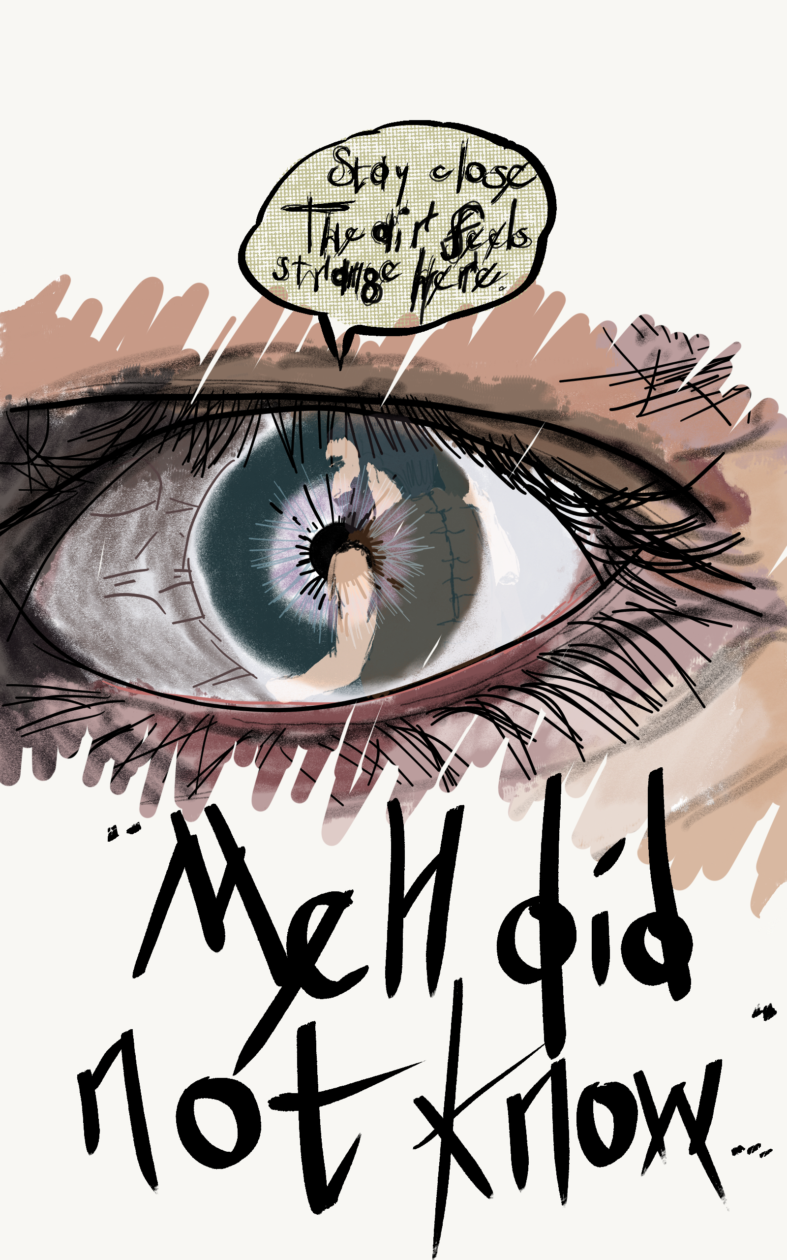


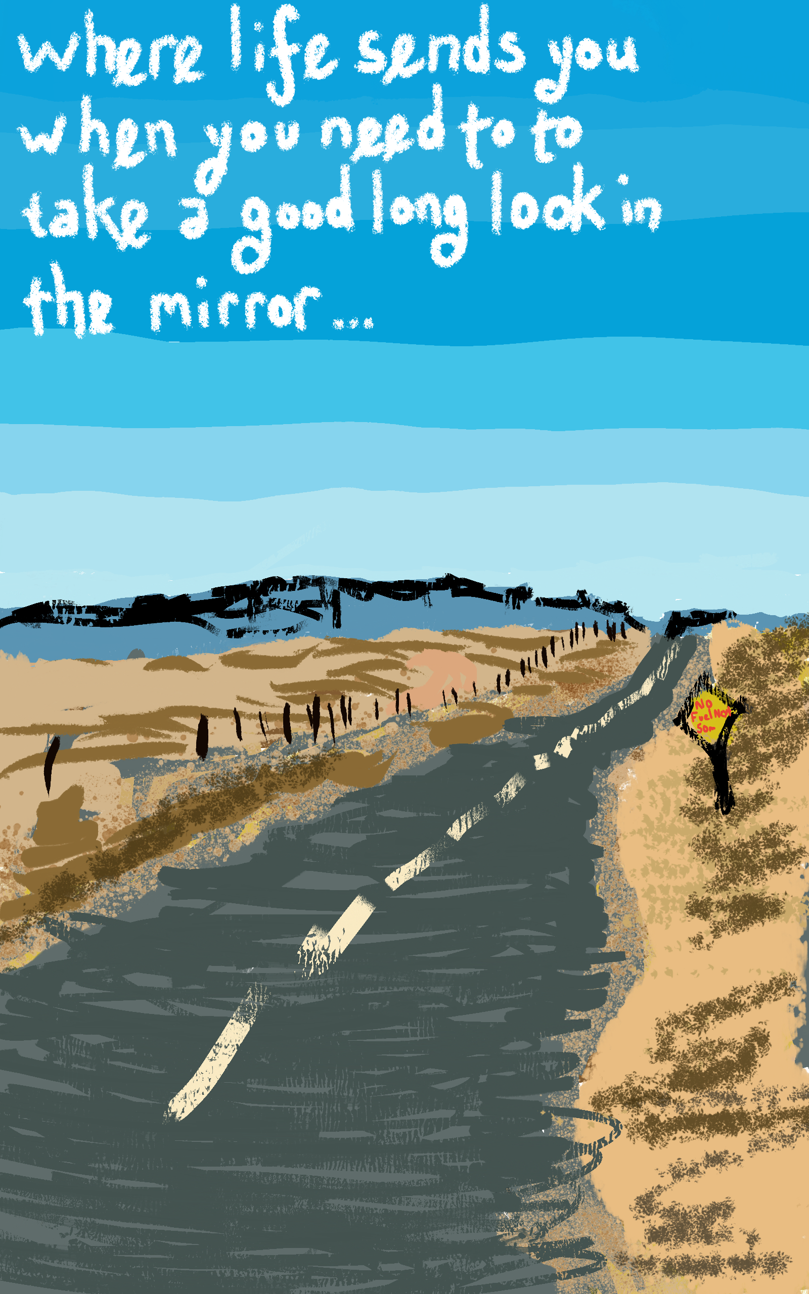

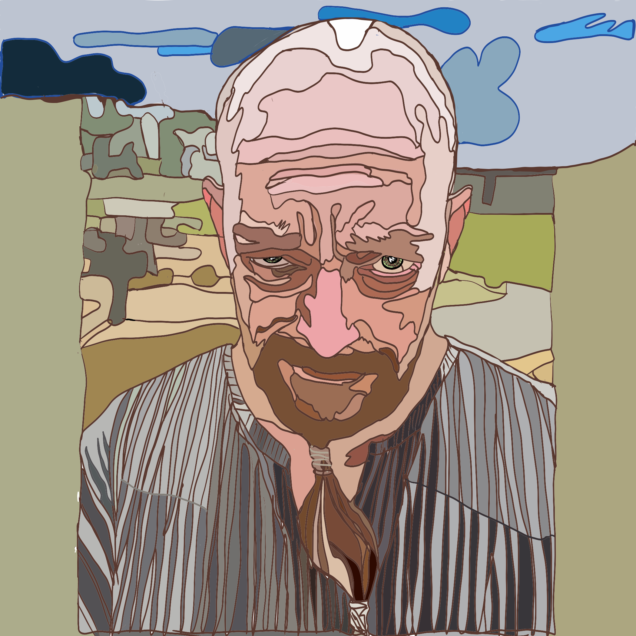
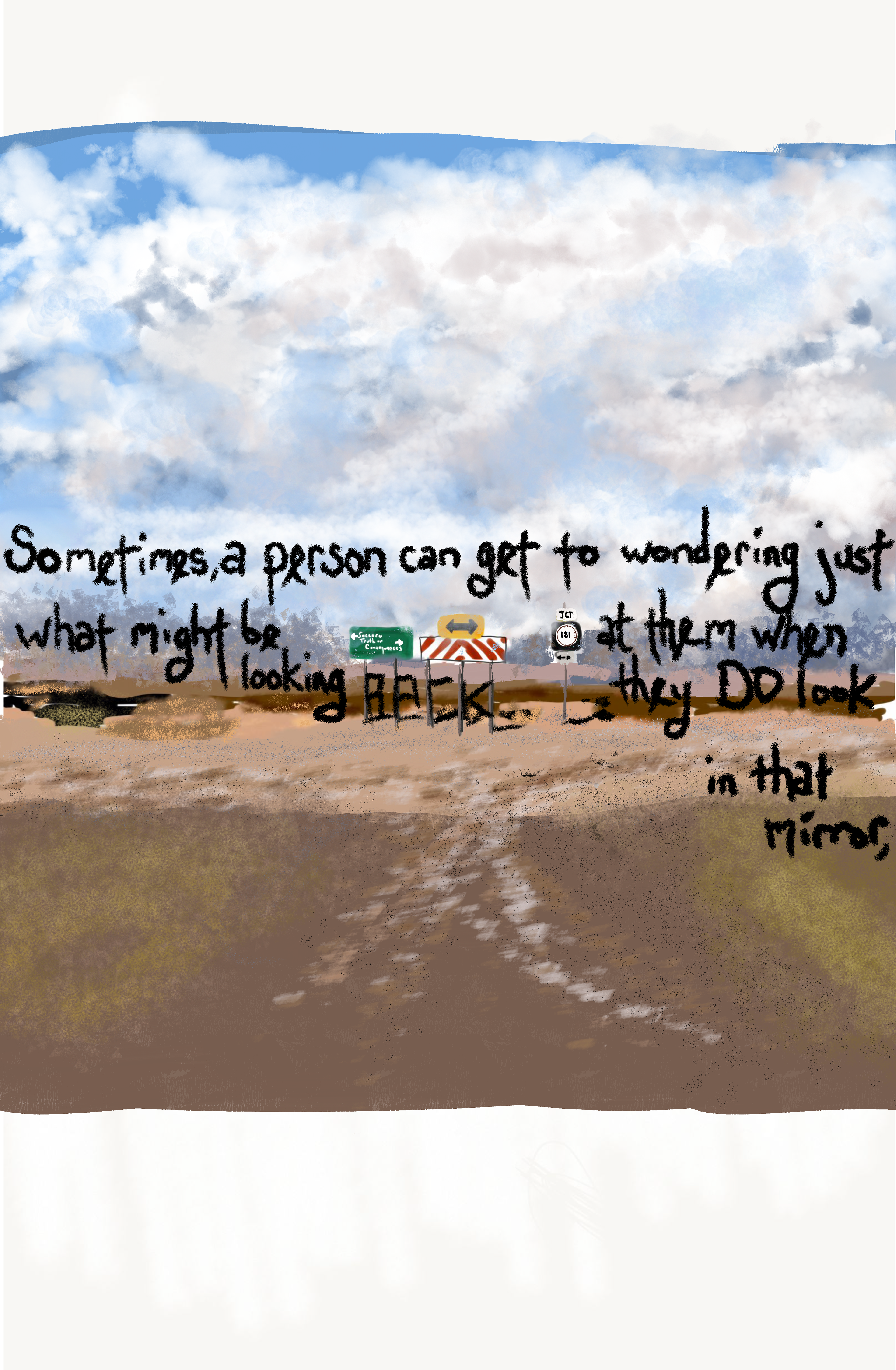
The Top 5 above have been published on LinkedIn this last couple of weeks. About a panel every other day or two. I "preview" the next panel teaser in the cover on the YobiWorks Studios page. What is complete and ready to go SHOULD be obvious with the rest. After the Prologue: The Climb Down ends with the Deeper Still panel and we enter the introduction of [Meh, Prisoner One, Anthromorphic Designation-"Magdalenian"/Location: SUBJECTIVE ISO. CRUX, Rep. 1/SELF ID-"Meh; m'-eh"] Effectively, Chapter One introduces 4 distinct timelines that are woven together through the Natural Cave System Query. The layers, backstories, lessons, depth availability and potential are endless with the story structure I designed.
This is the collection of my initial attempt to create a monthly 3-minute webtoon using FlipAClip Animation app using my Sam Tab 4. It took nearly 2 months to get this done having never animated, storyboarded, etc. I decided it was to labor intensive and began exploring publishing a webcomic to generate some interest in The Crux. Initially named The Cave 2.0, and based on Plato's allegory, the Cave, in Republic. Everything you see in Behance, and within this project, I learned as I created. The Graphic Novel version I decided to publish on LinkedIn, and I may be the first to do so, was to again, generate interest. I also broadcast many episodes called, The Cave 2.0, The Truth, and Finally, The DIY Animator.
These were all Adobe Photoshop Sketch. I had been in a hurry and seeking validation still in my life at the time. I am VERY satisfied with the patience I demonstrated with myself in forcing myself to wait and improve. Well, listening to my "gut" intitally. Fortunately, it was demonstrably wiser than consious me then. I like not having to rely on it quiet so much, although patience will be a lifelong habitual goal that I will strive to gain an abundance of!
I could have published it but I can never bring myself to put anything out into the public sphere that I am not satisfied with. If Fine art, I will not let it go until I can be pleased with it potentially hanging in the Louvre for at least 1 millinea. Digital, by nature of the sheer volume created, not so much. Both the title and the storyboard itself grew in maturity from this at the end of Christmas 2019 to Sep 2020.
initially created with Adobe Photoshop Sketch, the differences are enormous when side-by-side with the Adobe Fresco version. Above: Sketch Below: Fresco
Since beginning to learn #AdobeFresco, m skills have grown exponentially. I knwo there are videos, but I am a visceral, hands on learner. And starting out at 46 years old, I was anxious to create. This was the first panel I visioned using Adobe Photoshop Sketch. I will get back to it soon, unfortunately, the intentinoal "seeming" design flaws in the Samsung Android Galaxy Tablet 6 without a doubt lead to misplacing and loosing their Stylus. Sine this panel I bought 3 to ensure I would always have one available. Unfortunately the suddenly necessary to charge stylus w/ v 6, is knowcked off with a babie's breath on the MANADATORY and very specific placement requirement of the stylus. All 3 were missng within a month. That is nearly $200 of Stlus, which have YET to be located. The sylus also are colored in pastel and dark colors which apparently deploy a masking cloak of blending into anything, Samsung makes an incredible tablet that I adore, the stlus issue is enough to make me announce the design weaknesses via television program interruption bulletin at least once daily nationwide. It KILLS creativity. Maybe Adobe can have a chat with them. That would be nice.
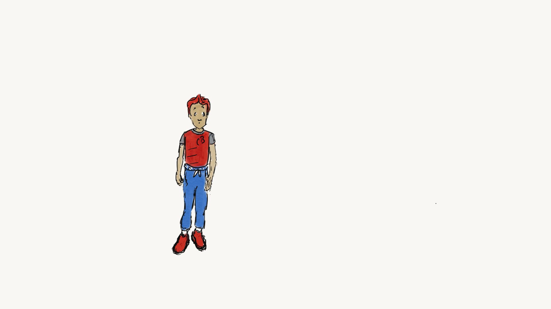
This was the one of the first panels I created using Fresco. The challenge was learning what the brushes could do. Understanding the scope of options and the amount of control I could exert in the creative process.Since this panel, I have re-worked much of the layout, progression, thrust, and intention of how we forst meet "Red" in the first Chapter, Enter Red. This became 5 panels, and ore may be added while publishing. Certainly, I have never been pleased with anything seen here other than the fact that it is a snapshot of my first foray into using Fresco.
This panel is the first where I felt like I was expressing my own artistic stamp. I began playing around with it after the outline was complete, and since I felt it added to the feeling of what IS humorous when Prisoner 8 first wakes, and the first image she sees is |!
This was the first panel created using Fresco where the lessons learned this last year began to come together and demonstrate a level of competency with the format that I felt comfortable with. I set exacting standards for myself, so this is the first I felt COMFORTABLE with, it is not ready for publication yet.
Early Fresco experimentation.

